
This is the re-uploaded version of "How to Skin foobar2000 Part 1" projects. All credits belongs to Markkoenig (the original poster).
I've been asked to write a tutorial on skinning foobar2000, because many f2k users encounter difficulties modifying skins or simply using them. I'm not an expert on the subject, I've started by installing a few skins and trying to understand how that worked ; I still think it's the best way to get a good handle on it, though a long and sometimes frustrating way. I invite you to try and see by yourself, to keep in mind that errors come all along and to share any advice, question, difficulty or anything you want to say, may you be new or expert. I also recommend to read this good tutorial (though it's partly based on outdated PanelsUI), maybe this less developed one, some of the very useful HydrogenAudio's forums and the few links I'll drop here.
I've been asked to write a tutorial on skinning foobar2000, because many f2k users encounter difficulties modifying skins or simply using them. I'm not an expert on the subject, I've started by installing a few skins and trying to understand how that worked ; I still think it's the best way to get a good handle on it, though a long and sometimes frustrating way. I invite you to try and see by yourself, to keep in mind that errors come all along and to share any advice, question, difficulty or anything you want to say, may you be new or expert. I also recommend to read this good tutorial (though it's partly based on outdated PanelsUI), maybe this less developed one, some of the very useful HydrogenAudio's forums and the few links I'll drop here.
This first part intends to be an overview of the whole thing ; a second part made by slowboyfast will guide you through a step-by-step on how to create graphic elements only with foobar2000's drawing functions ; and a third part by FlipOut69 will propose detailed presentations of some customization functions. If you don't want to go too far into skinning and are okay with the standard interface, the first link hereabove might satisfy you, specially CUI's specific options. Now if you're ready, let's hop in! 
The tutorial
Recommendations
- Always keep your components up-to-date, unless it may cause compatibility issues.
- When installing a skin, check the version of foobar it's been designed for. Avoid installing old skins on current foobar versions and vice versa.
- Backup your files if you're not sure of what you're doing ; export or copy your working scripts when you're about to take risks.
- I personnally recommend to install skins in fresh foobar2000 installations to avoid compatibility issues between different versions of a component (WSH Panel Mod in particular). That being said, if you've checked the components and their version and there's no conflict, you sure can install several skins on a single foobar2000. Beware the updating of components, which can disable a part of or the entire skin ; however it doesn't happen a lot 'cause AFAIK no component is currently under development.
- I mostly use portable installation instead of normal installation, for it's easier to install skins into and you can multiply your foobar2000s as much as you need, knowing that there will be no conflict of any sort (no need to update anything or to have two skins aside). Just copy the core files (database etc.) from an installation to the other to keep your library and media player settings.
- If you're good at coding and you're not too ambitious, you can stick with foobar2000's code to create graphic elements. Otherwise, you can decide to use Photoshop or Gimp or any other program to create images that you'll assemble using Panel Stack Splitter.
Useful links
- foobar2000 official components' page
- Columns UI component
- Panel Stack Splitter & ELPlaylist components
- Foobar2000's Title Formatting (TF)
- ELPlaylist's syntax
- Panel Stack Splitter manual
- UI_hacks component download link
- WSH Panel Mod official page with download link.
Installation
Installing a downloaded skin depends on :
- Its complexity. The use of certain components might require new folders, system files, etc. Look out for instructions on skins' description.
- The type of foobar2000 installation.
- On a portable installation, just throw everything in the installation's folder.
- On a standard installation, the typical process is to put the skin and the component in foobar2000's main directory, whereas the configuration files go to C:\Users\[you]\Documents\AppData [hiddenfolder]\Roaming\foobar2000\configuration. Some components manually installed may be situated in ...Roaming\foobar2000\user-components folder. Again, it's rarely that simple.
Wether you want to install or create a skin, remember that the common use is to create a "skins" folder in foobar2000's directory, where one puts the skin files.
Default UI
Foobar2000 comes with a default interface (DUI) that is easy to customize but very limited. It works perfectly and is very fast, but its features are quite limited to changing fonts, colors, stock elements, their position and their size. You access its parameters the first time you run foobar2000, and later either in Preferences/Display/Default UI or in [toolbar]/View/Layout/Enable Layout editing mode. In Prefs/Display/Default UI/Playlist View, you can add custom columns and grouping schemes using foobar2000's Title Formatting. Using the View/Layout/Enable layout editing mode command (under CUI, it's View/Layout/Live editing), you'll be able to choose and move the UI elements within the player's window. All the elements are on the same layer, placed side-by-side ; to put several elements at the same place, you have to add Tab Stacks (Enable layout editing mode, then right-click on the UI element and "Add splitter"/"Add panel").
So the first important thing to think about when one is designing or modifying a skin is its organization. The overall structure is ruled by "layers" assembled in hierarchy, in which you add and dispose panels of various sizes, in which you place one or several UI elements. To add panels or UI elements, right-click on a splitter in the Layout tab and choose "Change splitter type" or "Insert panel".
Now let's have a look at the ELPlaylist scripts, on another skin. CUI, PSS and ELP (and some more) use the same syntax, but there are function that don't work on some panels and/or some components for obvious reasons of inconsistency. By the way, as you can see on the screenshots below, I often tidy my script up so it's more convenient to read.
So here are some examples on how to organize a script and combine functions on complex syntaxes. Now let's sum up the main and important rules.
Columns UI + Panel Stack Splitter
To really enhance your foobar2000 UI's experience, you have to use the Columns UI component, better combined with Panel Stack Splitter. All by itself, Columns UI won't offer many more possibilities. There used to be a few other components but they are outdated and no longer supported (Panels UI for example).
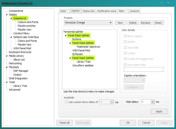
To edit in Prefs/Display/Columns UI, CUI allows you to organize the elements more freely using splitters to divide the window's space. There are six tabs in CUI's preferences page :
- The Main tab is where you import and export .fcl files and edit the window title string.
- The Layout tab is where you edit most of the graphic UI stuff, that's where we're gonna spend a load of time.
- The Status bar tab allows you to edit the bottom status bar which displays technical information. It's rather often deactivated anyway.
- The Notification area is also self-explanatory, it controls (optional) tooltip and tray icon options.
- The Filter tab is only useful when you use the Filter tabs element.
- And the Artwork tab is useless, for we use much more efficient artwork components or methods.
PSS allows the interface to be organized by panels rather than horizontal or vertical splitters as in DUI and CUI alone, and according to a hierarchical pattern : one or a group of elements can be assembled on one part, which can be displayed alongside or submitted to others. This way, you can have different parts in your skin behaving differently. And it is able to run scripts by itself. Instead of stand-alone elements separated by visible frames, PSS can combine multiple elements on one panel, with or without frame. The elements on a panel can thus behave differently than the panel itself, managed by Columns UI. Though it may seem a bit messy, it offers way more possibilities than the tabs system of DUI.
The Layout
So let's talk about this Layout tab. First thing is to erase whatever element is here by default (NG Playlist normally) and to insert an horizontal or vertical splitter as a base, or a PSS (right click/insert). Then all you have to do is adding elements and/or panels according to what you need and to the way you want to organize your skin. Let's look at this example below. The upper Splitter in the Layout tab is the main splitter, it's the general "background" of the skin, though it's displayed first in the list it's the lowest of all ; but every submitted element is listed from top to bottom, as it is on the actual skin. Remember that any element called in a PSS script is overpassed by the element(s) this PSS is running. The hierarchy is to be set in this same Layout tab, by right-clicking on the elements and selecting "Move up/Move down" ; the presets menu allows you to store several organizations in the same .fcl. Technically, one can create multiple and totally different skins and store them in a single .fcl file. The panels and elements can be edited by selecting the main Panel Stack Splitter and clicking "Configure" (you could also directly select the panel or element you want to edit, but I often observed that it causes the hierarchally upper element to reset).
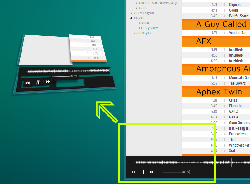
Here on Monolite Flat, you can see that the elements are organized one above the other. The waveform seekbar is the lowest component above the first/main Panel Stack Splitter, which runs the prev/play/pause/next buttons (that's why you don't see them in the list, they're in its script) ; then there is another PSS above, running the Library Tree, then the ELPlaylist which is submitted to the main PSS, etc. until the toolbar buttons, the upper elements of the skin. See the second screenshot, it should be clearer.
The WSH elements are gathered on one panel (the black one) and though there are 3 of them, two other components just nearby and 3 buttons on the first PSS, it all seems united and consistent.
The Coordinates
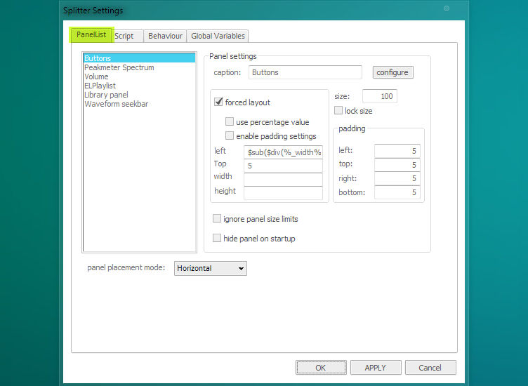
Once you click "Configure", the PanelList tab shows the current UI elements (PSS or components) that are submitted to (or managed by, if you want) the PSS you are currently editing. The elements are listed from top to bottom, meaning the first one is on the top layer, the last one on the bottom layer ; you have to take this into account if one panel or element is supposed to cover the other(s). Tick "forced layout" to allow panels and elements oversizing each others and other tricks. You can use TF to edit values, which would be much more practical. For example, coordinates set by numbers are okay to set an element's position (x,y), but it may be wiser to use a TF value like %_width% (returns the windows' width) if the window must be resizable. Choose one or the other, depending on the case. Ticking "ignore panel size limits" allows you to arrange elements out of their panel's limits. "Hide panel on startup" should be used when you have a button to make the element appear. Be careful when editing those, quite often you don't see the element you just placed, cause it's out of range or hidden under another element.
Everytime you are done with editing one of these dialog boxes, hit "Apply". You will notice that when you hit "OK", you can't edit hierarchally previous elements : the dialog box is empty. You have to validate the whole modification by hitting "OK" down to "Apply" on the Layout tab before you can go back editing PSS and elements.
Colours and Fonts
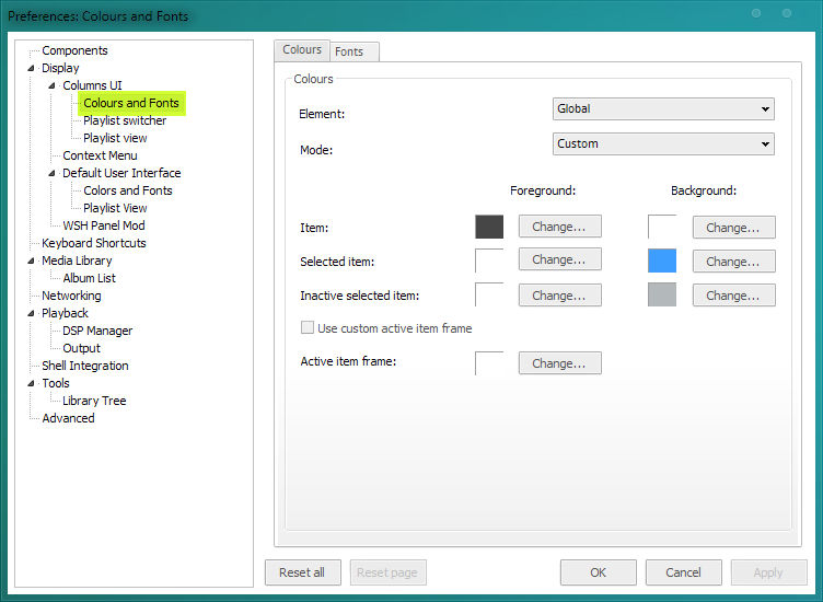
Just like in the DUI options page, you can edit the colours and fonts of both stock foobar2000 UI and some third-party elements ; assuming you haven't set them already (using scripts for example). Some third-party components allow you to access their UI preferences both by right-clicking in it and by using this menu.
Scripts
The other important aspect of f2k skinning is the use of scripts in order to customize how a UI element works and/or is displayed. Scripts rely on a syntax called Title Formatting (TF) that I recommend you learn to handle (see the links above). Multiple display options and stock components of foobar2000 use TF : the window title, the status bar, the notification area, the columns playlist, the metadata display, etc. ; as well as several components among which Panel Stack Splitter, ELPlaylist/NG Playlist, LibraryTree, etc. TF may be quite easy, on the other hand it is limited in its possibilities. If you are ambitious, you might prefer switching to JavaScript through WSH Panel Mod (see below).
NG Playlist
Its display options are to be found in Prefs/Columns UI (or DUI)/Playlist View or by right-clicking on one of its column titles/Preferences.
ELPlaylist
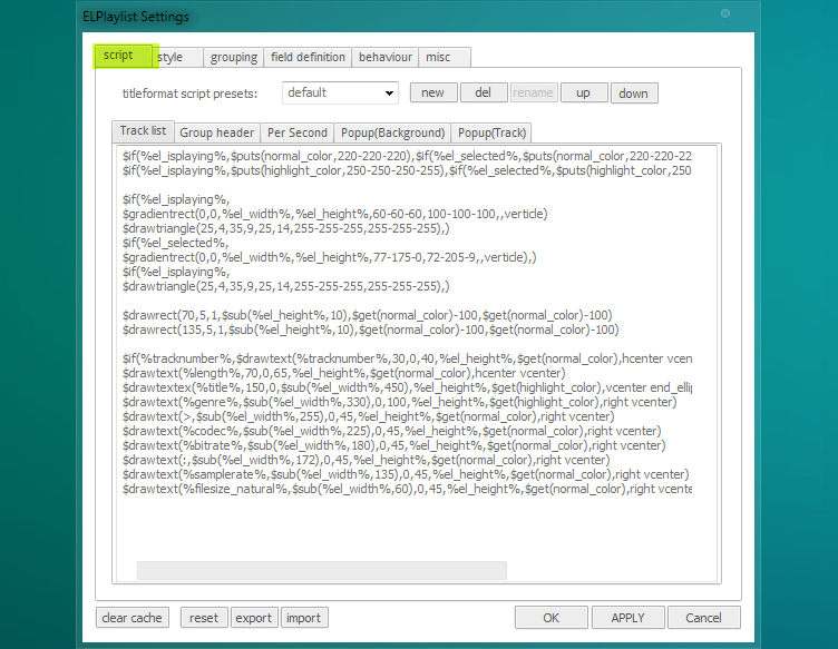
Its display options can be found in the Prefs/Columns UI/Layout tab or by right-clicking anywhere in it/Settings (if you do so, remember to save your skin in .fcl or any other modification applied will reset ELPlaylist to its last saved settings, due to some sort of priority conflict). ELPlaylist's modifications are divided into two sections :
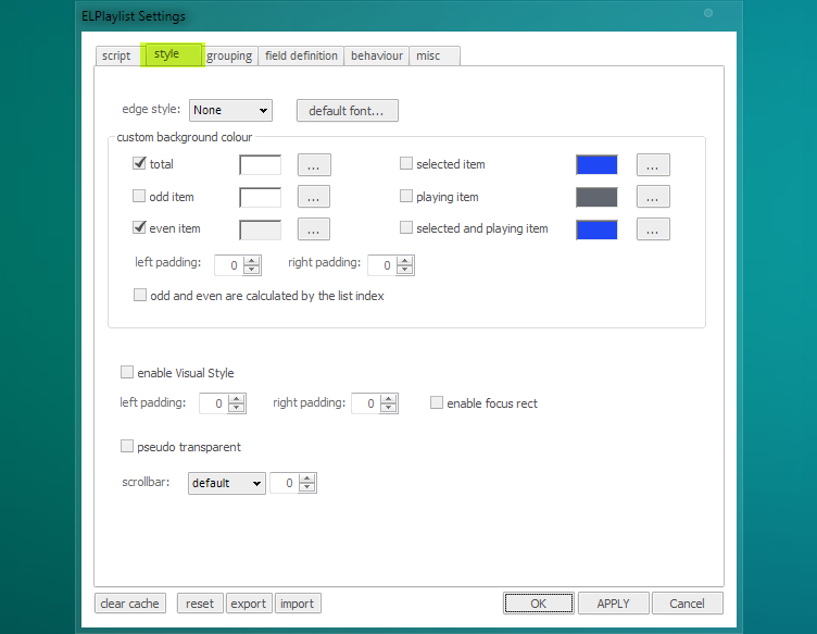
- what is true for the entire element : Style, Field definition, Behaviour and Misc tabs ;
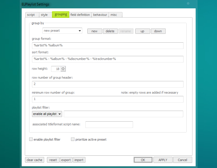
- what is true for one script at a time (ELPlaylist can host multiple scripts, i.e. multiple custom library displays, which you can switch between) : Script and Grouping tabs.
Now let's take the tabs one by one. Remember there's a manual that explains everything (but in a very poor english). And notice that the scripts are run from top to bottom : for example, if you want to display a text string in front of a background image, make sure the image is called before the string ($imageabs... and later $drawstring). Again, taking a look into other people's work is very useful.
- The Script tab is where you... write scripts. Track list refers to the library track list of your music : this is where you display informations like title, length, track number, etc. Group header is also self-explanatory. As for the track list, you can display a hell lot of things in many ways using forms, colors, pictures, etc. Those two sections are updated everytime there is a track change or an action from the user (adding files, refreshing, etc.). Per Second is updated every second (+ go to Behaviour tab and tick "update every second") ; you can make a progress bar or display sliding informations, etc. Popup (Background) and Popup (Track) can be used to display info within a popup when the cursor stays over a track ; this option's settings are in the Misc tab.
- The Style tab gathers the main display options for the entire UI element, as well as a few ones that can impact the track list. You can choose a custom default font, or directly edit it the scripts ; you can use multiple fonts and if you edit fonts in scripts, they will overpass this custom default font. You can edit odd and even items background to have an "iTunes look", but you can do it in the scripts as well. "Enable Visual Style" was designed for Vista and doesn't seem to be of any use. "Pseudo-Transparent" background however can be interesting, but we'll come back later on the topic of transparency.
- The Grouping tab sets the way your playlist viewer is organized. Group by allows you to name and store several grouping formats (such as Artist/Album, Albums only, tracklist sorted by artist, title, length, year, etc.) that you can access in the context menu ("Group by"). These options use TF. Group format refers to the way tracks are gathered, Sort format to the way tracks and/or groups are listed. Row height is the height of a single track line. Playlist Filter allows you to filter the library when using this particular grouping format ; i.e. you can have a grouping format called "Genre" where the tracks are filtered by genras. Finally, Associated titleformat script name allows you to link one particular grouping format to one particular display script (assuming you have given your script a name in Script tab/"Titleformat Script Presets"), that will automatically be activated when you activate this grouping format.
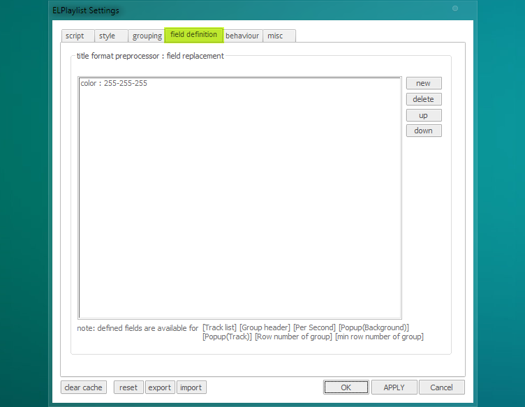
- The Field definition tab stores values that you don't want to repeat everytime it's needed in your scripts. Instead of writing a color value like 245-145-93-125 or a long path twenty times in your script, you can store them here and use the $get function.
- The Behaviour tab allows you to edit what happens when you interact with ELPlaylist.
- The Misc tab refers to the popup feature.
Panel Stack Splitter
It works just the same way with scripts. When you are in a Splitter Settings dialog box, there are four tabs (see above for PanelList tab).
- The Script tab allows you to use TF, just like in ELPlaylist. "PerTrack" will react on track change, "PerSecond" will be updated every second. This is where you can create text strings, buttons, display info, display images (graphic UI elements, background, artist pic, covers�), etc. ; see TF links for the possibilities. There is no complexity limit to your design, but keep in mind that the more elements the stock UI engine of foobar2000 has to create, the slower it will start and run. If you plan on creating a heavy and very complex skin, it can be wiser to switch to JScript.
- The Behaviour tab rules the behaviour of the panel.
- Global Variables is the equivalent of "Field definition".
You can submit as many PSS as you want to each others. If you select a component in the PanelList and hit "Configure", it will open its Preferences window ; sometimes this feature isn't available.
WSH Panel Mod
It's an extremely powerful component that simply host scripts in JScript or VBScript language. Almost anything is possible with it, far beyond TF's possibilities : you probably have seen some of Br3tt's work already. What's hard here is that you have to know JScript, or, as I'm doing so far, you can copy other people's scripts and modify them as far as you understand. A few samples are included in the component's package though. WSH Panel Mod is quite the key to an impressive skin.
Syntax basics
You probably won't write the syntax fluently right from the start, specially if it's your first contact with coding. It takes some time and -let's be honest- some endeavour to memorize sentences/functions, to avoid forgetting stuff and to get a good handle on the syntax' possibilities. Basically, the syntax used here is divided into two categories : values/field references and functions. A value or field reference is an information (size, position, color, opacity, metadata, count, etc.), a function is an action that is processed whether once-and-for-all (for example when starting foobar2000), at a specified moment (on track change...) or when you call it (by clicking on a button...). So generally speaking, a script is no more than a "find information, then call the action" process developped and multiplied. Thus, when you want to write a function, always make sure you bring the required information, or you might confront a crash or a big nothing and want to bang your head till you find the error. So we're gonna see the basics of understanding and organizing a script. Let's take a few examples.
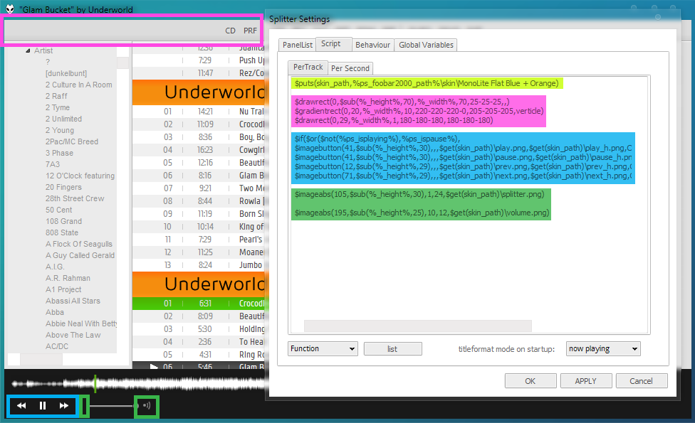
We are in the Script tab of the first PSS. On this very simple script, I called a few graphic elements, some drawn, the others based on pictures ; some static, others dynamic.
- In yellow is a basic information provider, the directory of the images used in this script. The $puts function allows you to store an information/value under a name, so that it's easier to call all along the script. Here I named 'skin_path' the whole information that is the path, '%ps_foobar2000_path%\skin... etc.' ; so below, in the blue zone, I just need the $get function to call this value and then finish the path of the picture : $get(skin_path)\play.png.
- In the pink zone I drew the background of the toolbar and the slight grey border beneath. As the script runs from top to bottom, I drew the light grey background first ; then I added a gradient, and then the border. As you can see, I use both numerical and dynamic values. The dynamic values, may they be numerical values like here or metadata (like track tags), are called with %...% (whereas functions are called by $...). Here I wanted to set a background that fits the window's width even after resizing, so I called the value %_width%, which is relative and constantly updated.
- In the blue zone, I drew the playback buttons. You can see a very common use of the $if function (or $if statement) which allows you to set various actions depending on the state of a value or a component : it works like $if(thisvaluereturnstrue, dothisaction, otherwisedothat). This is where the syntax begins to be more complex. This function here rules the play/pause button, which won't react the same way whether there's an ongoing playback or not. To avoid drawing two simple buttons side-by-side, I have to use $if to call alternatively two different buttons at the same place : if playback is going, "pause" button is displayed, if not, "play" button is displayed.
Now let's have a look at the ELPlaylist scripts, on another skin. CUI, PSS and ELP (and some more) use the same syntax, but there are function that don't work on some panels and/or some components for obvious reasons of inconsistency. By the way, as you can see on the screenshots below, I often tidy my script up so it's more convenient to read.
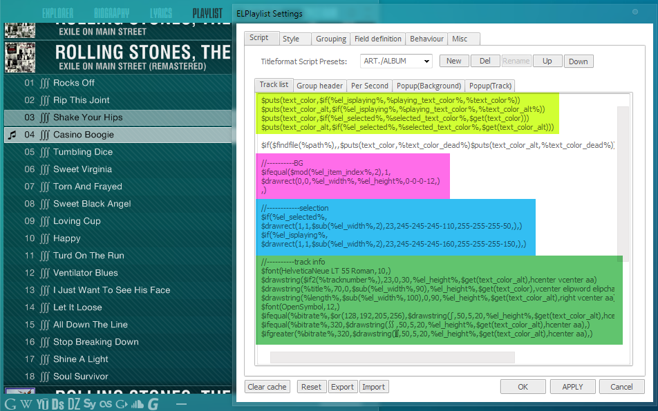
- So first, in yellow, are the stored values I already told you about. I could have put them in the Field definition tab, but I like to have them constantly under my eyes. Your call. As you can see, I'm using the $if function into the $puts function : that means that the stored value called 'text_color', for example, will change whether the track is playing or not, is selected or not. This way, if you just want the text color to change according to the track state, doing this will prevent you from typing "$if(%el_isplaying%, then all the $drawstring, and if not, use this other string", which is very much longer : instead, you type one string and only the stored value changes once. The important thing here is to keep in mind that most of the functions can be combined and articulated to obtain complex results (or simpler ones for the rest of the script). You can also notice the ')))' at the end of the 4th line : the more functions you combine, the more parenthesis you'll have to remember.
- In the "BG" zone, I set the "iTunes look" (/!\ not talking about the overall dark background : that background comes in a more global canvas. Here the ELP's background is transparent). To obtain the odd/even background effect, I used the $ifequal and $mod functions to activate the odd background when the result of [index number of the item in the group] divided on base 2 = 1, i.e. every other track ; instead of using fixed values like $if(%el_item_index%,$or(1,3,5,7, etc.)).
- Same trick in the blue zone to add rectangle layers when the item is selected or playing.
- In the green zone are listed the metadata to display on the item row. The $font function lets you set the font, size and type you want (N.B. : the $drawstring function only works with TrueType fonts ; otherwise, use the GDI renderer with $drawtext/$drawtextex, that can use both OpenType and TrueType). Then I add one string per data, but you can display as many metadata as you want on a single string.
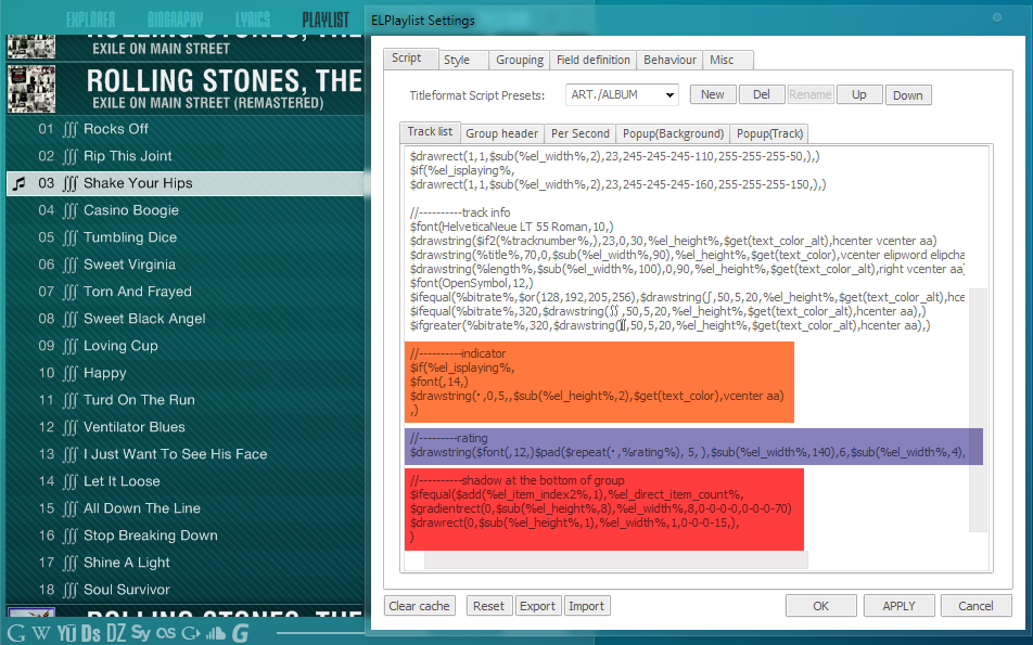
- Same thing with the indicator, for which I used a special font.
- For the rating indicator (invisible here), I used $pad and $repeat according to the rating metadata to display the right number of characters side-by-side.
- Eventually, I told ELPlaylist to add a shadow effect (gradient) on the item which index number equals the total number of items in the group, i.e. the last item of the group.
- '//' disables the line.
- Be careful when combining functions, you need to have the correct number of '(' and ')', and generally speaking watch your typing, any missing coma will disable or mess up the whole rest of the script. When you write a sketch, use tabulations instead of straight lines to see clearly what you're doing.
- It's better to plan what you want to do before doing it, in order to decrease the risk of errors and sterile wanderings.
- Always prefer relative and dynamic values over fixed/numerical values when you can use both.
- Think of every data you need before calling the function.
- The script is run from top to bottom, so organize it wisely.
- Create or modify one thing at a time so as to quickly find the bug.
- When you combine several functions, remember that the deepest function will be called first, and the other(s) above in this processing order. If you write $if($add($div($get(..., f2k will first get the value, then divide, then add and finally check if it returns true or false. Sometimes it's not the case : a single $if is very simple, for the process will be 'if[value]=true, then apply this, otherwise apply this'. So you have to think in terms of priorities.
- If you can't find a function to do straightly something you need, there's almost always a way to go round.
- Write the script in its appropriate component/tab.
- Simplier is always better.
Transparency
Transparency in skinning is a very nice feature, sometimes a pain to handle though. There are various options to get transparency :
- In Columns UI "Main" tab, the box "Use transparency" applies to the whole window. I used to use it with DUI, black background and white font, I could have something... but that's pretty much all.
- In the Splitter Settings/Behaviour tab, the box "Pseudo Transparency" allows a background set in the Script tab to appear through an element. It won't let you see a component placed under.
- Some components have a transparency feature (ELPlaylist, Lyrics Show Panel 3, Biography View, Channel Spectrum...) which may work different ways.
To sum up with, the default transparency feature lets the panel background appear through the component ; I guess that's why they're often labeled "pseudo transparency". It may be a bit difficult to build complex transparency-based skins with the default feature, you may have to find tricks. Otherwise, there are two external means :
- Again, JScript can apply transparency (almost) anywhere.
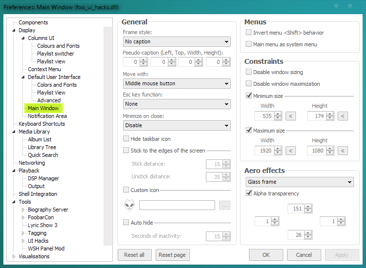
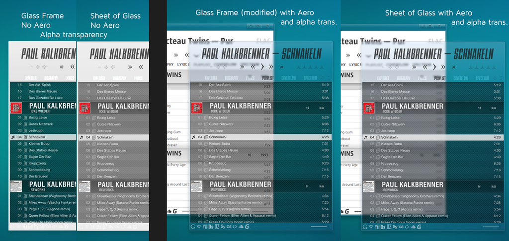
- The other and easier means to obtain transparency is the UI_Hacks component, which hasn't been approved by foobar2000 creators and is often flagged as buggy and/or Trojan (because of its name). I personally never had any problem with it. It provides true transparency, so that you won't see any background but your Windows desk or any program running behind. You will find its option in the Prefs/Default UI/Main Window tab. From here you can :
- Modify or disable the window frame.
- Modify the window's behaviour, lock it, disable its resizing or edit a specified size.
- And what's interesting here, add various transparency modes. "Disable" disables Windows' Aero effect (provided you're using it). "Glass Frame" replaces Windows' default frame with one that you can edit with the values below. I used this mode in Lux to have a selective blur. "Sheet of glass" seems to activate a selective and blurred alpha transparency based on the colors' weight : a dark or solid color won't be affected whereas a light color will be affected by the transparency. Apart from these modes, the box "Alpha transparency" allows you to apply transparency to the whole window : selecting "Disable" and ticking "Alpha transparency" will make the window totally transparent but will leave the frame solid, unticking it and choosing "Glass Frame" will leave the background solid, etc. Don't forget that these transparency features depend on Aero's availability. If you're using visual styles that disable Aero, you might obtain slightly different results. Moreover, some fonts and antialiasing/ClearType don't like alpha transparency, so you might sometimes experience ugly renderings.
Well I guess that's it for now. Hoping you'll have a better understanding of the core of foobar2000 skinning, before reading the next parts. Feel free to comment and share, and to ask any question ; I'm open to suggestions and corrections/addenda. Let's do some skins! 
0 comments:
Post a Comment